Author and publish
MDX components
MDX is Lisible’s default article format. It keeps all syntax presented in Extended Markdown and allows components inside prose. Every reference below shows complete copyable code, followed immediately by its actual rendering.
Imports
React and Astro components must be imported after frontmatter and before the first content. An import adds no browser JavaScript until its component is used. The github and drawio Markdown directives are provided by the processing pipeline and require no import.
Code
---title: "My interactive post"description: "An example using Lisible MDX components."pubDate: 2026-07-19---
import { Tabs, Tab } from "@/components/ui/tabs";import { Steps, Step } from "@/components/ui/steps";import { Tree } from "@shared/components/ui/file-tree";import Spoiler from "@/components/Spoiler.astro";import Diagram from "@shared/components/Diagram.astro";Rendered output
Imports produce no visible element. They simply make Tree, Tabs, Tab, Steps, Step, Spoiler and Diagram available to the examples that follow.
File tree
Tree displays an interactive file hierarchy shared by all six variants. Folders can be opened independently, files can be selected and the global control expands or collapses every folder. Use it for project structures where a static text tree would hide useful detail.
| Property | Type | Default | Purpose |
|---|---|---|---|
elements | TreeViewElement[] | [] | nested files and folders |
initialExpandedItems | string[] | [] | folder IDs open on first render |
initialSelectedId | string | absent | initially highlighted item |
indicator | boolean | true | branch connector lines |
sort | "default", "none" or comparator | "default" | folders-first natural sorting, source order or custom order |
dir | "ltr" or "rtl" | "ltr" | text direction |
className | string | empty | extra classes on the container |
client:load | Astro directive | required | enables selection and folder controls |
Every element needs a unique id and a name. Set type to file or folder; an item with children is also inferred as a folder. isSelectable: false disables selection while preserving the item in the hierarchy.
In an MDX island, use "default" or "none" for sort because Astro serializes properties across the server/client boundary. A comparator function belongs inside a React wrapper component.
Code
import { Tree } from "@shared/components/ui/file-tree";
<Tree client:load initialExpandedItems={["src", "pages"]} initialSelectedId="home" elements={[ { id: "src", name: "src", type: "folder", children: [ { id: "pages", name: "pages", type: "folder", children: [{ id: "home", name: "HomePage.astro", type: "file" }], }, { id: "styles", name: "styles.css", type: "file" }, ], }, { id: "config", name: "lisible.config.json", type: "file" }, ]}/>Rendered output
Tabs
Tabs groups alternative content without making the page longer. Use it for equivalent commands, configuration variants or examples in several languages. Each item in tabs maps to one Tab component in the same order.
| Property | Type | Required | Purpose |
|---|---|---|---|
tabs | string[] | yes | tab labels and order |
label | string | recommended | accessible name for the group |
defaultTab | string | no | tab selected on initial load |
className | string | no | extra classes on the container |
client:load | Astro directive | yes here | enables clicks and keyboard navigation immediately |
Tab accepts MDX content and an optional className property. Keep the number of Tab children equal to the number of labels: panels are matched by position.
Code
import { Tabs, Tab } from "@/components/ui/tabs";
<Tabs tabs={["bun", "npm", "pnpm"]} label="Package manager" defaultTab="npm" client:load> <Tab>
```bash bun install bun run dev ```
</Tab> <Tab>
```bash npm install npm run dev ```
</Tab> <Tab>
```bash pnpm install pnpm dev ```
</Tab></Tabs>Rendered output
bun installbun run devnpm installnpm run devpnpm installpnpm devThe component exposes tablist, tab and tabpanel roles. Left and right arrow keys switch tabs, while Home and End reach the first and last. The label should therefore describe the available choice instead of repeating “tabs”.
Steps
Steps presents an ordered procedure with visual numbering and connectors. Each Step represents one coherent action; its title should begin with a verb, and its body can contain paragraphs, lists, links or code blocks.
| Component | Property | Type | Required | Purpose |
|---|---|---|---|---|
Steps | ol attributes | HTML attributes | no | customize the ordered list |
Step | title | string | yes | visible step heading |
Step | li attributes | HTML attributes | no | identifier, classes or additional data |
This component has no interactive state: do not add a client:* directive. It renders as static HTML.
Code
import { Steps, Step } from "@/components/ui/steps";
<Steps> <Step title="Create the bilingual pair">
Run `bun run new-post guide --translate` to create both `.mdx` files.
</Step> <Step title="Import the components">
Put imports after frontmatter and before the first paragraph.
</Step> <Step title="Validate the result">
- test keyboard use; - check light and dark themes; - run the static build.
</Step></Steps>Rendered output
Create the bilingual pair
Run
bun run new-post guide --translateto create both.mdxfiles.Import the components
Put imports after frontmatter and before the first paragraph.
Validate the result
- test keyboard use;
- check light and dark themes;
- run the static build.
Spoiler
Spoiler blurs a short answer until a click or activation with Enter or Space. It accepts only its child content and needs no hydration directive because its behavior is owned by the Astro component.
Code
import Spoiler from "@/components/Spoiler.astro";
The answer is <Spoiler>islands architecture</Spoiler>.Rendered output
The answer is islands architecture.
GitHub card
The github directive turns an owner/repository identifier into a clickable card. The link works immediately, then a client-side script enriches the card with the available description, language, stars and forks. No MDX import is required.
| Attribute | Format | Required | Purpose |
|---|---|---|---|
repo | owner/repository | yes | GitHub repository to display and link destination |
Code
::github{repo="didntchooseaname/lisible-docs"}Rendered output
Use a single card when the repository is the primary destination. For a reference list, plain links remain faster to scan.
draw.io diagram
The drawio directive loads an SVG export created with draw.io into a viewer with zoom, pan, reset and full-screen controls. Full screen uses the same browser API and viewport-overlay fallback as Mermaid and closes with Escape. The Markdown image nested inside the directive acts as a fallback if loading or script execution fails.
| Attribute | Type | Required | Purpose |
|---|---|---|---|
src | public path to an SVG | yes | exported draw.io file to load |
title | string | recommended | accessible diagram name |
The fallback image’s alternative text must describe the information in the diagram. It should not stop at “diagram” or repeat the filename.
Code
:::drawio{src="/images/demo-ilots.svg" title="Islands pipeline"}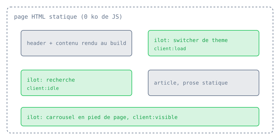:::Rendered output

Inline SVG schematics
Diagram inserts a schematic straight into the HTML rather than loading it through <img>. That is what makes it live: an inline SVG inherits the page custom properties, so its strokes follow the accent the reader picks in the header and its surfaces follow the active theme, with no JavaScript and no extra request. An SVG served through <img> stays isolated from the page and cannot do that.
Three schematics ship with the framework: islands, pipeline and tokens. Pass the locale so the labels and the caption match the article.
Code
import Diagram from "@shared/components/Diagram.astro";
<Diagram id="islands" locale="en" /><Diagram id="pipeline" locale="en" caption="From source file to served page." />Rendered output
A figure with a caption, sized by aspect ratio so it reserves its space before paint. Add your own by extending the copy map and the drawing branches in shared/components/Diagram.astro.
Choosing hydration
A client:* directive belongs only on a framework component that needs browser JavaScript. Astro components such as Spoiler own their scripts, while purely static components such as Steps need no hydration.
| Directive | Activation time | Use |
|---|---|---|
client:load | on page load | immediately necessary interaction such as Tabs |
client:idle | when the browser becomes available | non-critical enhancement |
client:visible | near the visible area | interactive component far below the fold |
When unsure, start without a directive: add one only when the framework component contains state, an event or a browser API that must run on the client.